Here are the best elements your dental website needs to succeed. Peruse these website examples and read about why these elements are must-haves for dentists who want to attract more new patients.
Is your website lacking? Call (970) 672-1212 or schedule online to set up a consultation with one of our digital marketing consultants.
1. Responsive Website Design
The best dental websites have a responsive website design, it’s a must to attract new patients. You don’t know if your patients will find you on their computers at work, tablets at home, or phones on the go. Your website needs to provide a top-of-the-line patient experience regardless of how they’re viewing it. Starting on the right foot with a great first impression makes you more likely to gain patients for life.
Contemporary Dentistry: Designed by Pro Impressions Marketing
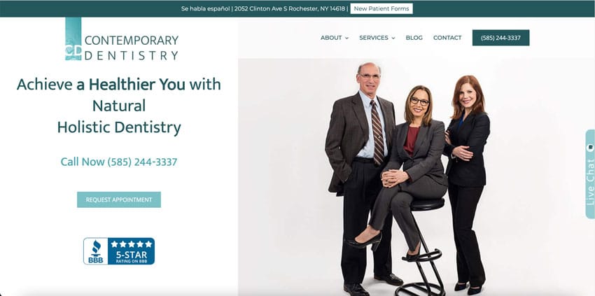
Are you viewing this website from your phone? Great! Do you notice how every element is easy to read, fits on the screen, and is easy to touch? Now view it from a tablet. All the elements have the same qualities; they’re easy to read, fit on the screen, and easy to click. If you were to view this website from a computer, you’d get the same excellent user experience.
Village Dental

Try viewing this website from multiple different devices. You’ll find that Village Dental’s website is easy to navigate, too.
Your Website
Now, head over to your website on your phone and tablet, then ask yourself these questions.
- Can you easily read all the words?
- Are all the elements easy to click?
- Are any of your photos or videos cut off?
- Does your homepage banner fit the screen?
- Is your menu easy to navigate?
2. Stand-Out Calls to Action
A call to action or CTA isn’t silly marketing jargon. It’s the button on your website that says, “Request Appointment,” “Call Now,” or “Schedule Online.” It’s the button that tells prospective patients what to do next. It literally calls your patients to action.
You might think that having a clear call to action isn’t necessary because patients know that to get an appointment, they need to request one. While that’s true, the best dental websites have a call to action that tells patients that now is the time to book and gives them an easy way to do it.
Do you want more patients? If yes, make sure your website has clear calls to action. Your calls to action should be prevalent on each homepage section in a color that stands out. Repeatedly suggesting that someone request an appointment leads prospective patients to do just that. And on the responsiveness topic, your CTA’s need to have these same qualities on every device.
Iowa Sleep & TMJ: Designed by Pro Impressions Marketing

Iowa Sleep & TMJ is an excellent example of stand-out calls to action. Right away, when you visit this website, you see that the main action you need to take is to request an appointment. The CTA is in a different (still tasteful) color and on every homepage section. Did you notice that the homepage banner houses a call to action? That’s because you want a CTA to be one of the first elements your patient sees. It’s easy to find and easy to use.
Village Complete Dentistry

Head over to Village Complete Dentistry’s website. The muted colors make the orange CTA stand out, and you know exactly what they want you to do. The power of suggestion is real!
Your Website
Check out your website and ask
- Are my CTAs easy to see?
- Are my CTAs in a stand-out color?
- Do I have a CTA on my banner?
- Are my CTAs just as prominent on mobile?
- Do I have CTAs often enough throughout the homepage?
3. Patient Images
At Pro Impressions, we talk about being patient-focused a lot. Having a patient-focused website means that every word, image, and video sends the message, “this is what your life could be like after treatment with us.” This means that the best dental website has photos of patients. Seeing smiling people with great teeth, happy people who are no longer in pain, or finally getting enough sleep helps patients see themselves with those same positive outcomes. Images of happy people invite patients into your story and tell them, “hey, you can have these things too!”
Michael T. Rosen: Designed by Pro Impressions Marketing
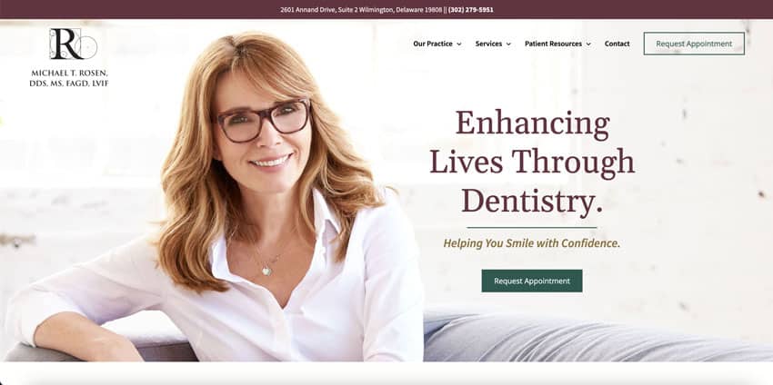
Take a moment to scroll through Dr. Rosen’s website. You’ll see that he has high-quality, patient-focused images throughout his homepage. If you click on internal pages, you’ll also see patient-focused photos. Prospective patients who look at Dr. Rosen’s website can easily imagine themselves with the same excellent outcomes as these smiling people.
Archpoint Implant Dentistry

This website has a great banner image of someone thrilled to have beautiful dental implants. Archpoint Implant Dentistry has images of happy people throughout its website, making it easy for prospective patients to imagine the same results.
Your Website
Take a look at your website and ask these questions.
- Are the images on my website of patient results?
- Does my website have too many images of dental implants or technology?
- Are my images high quality?
- Is the photo’s name search engine optimized?
- Are my images relevant to my target market? (Age, gender, etc.)
4. Crystal Clear Copywriting
Have you ever visited a website only to be confused about what the company does, who they help, and how to get what they offer? You likely just moved to the next website. If your website doesn’t have crystal-clear dental copywriting, you’ll lose patients to someone who communicates more clearly.
The best dental website will clearly and quickly communicate that you’re a cosmetic, TMJ, sleep, or [insert type] dentist. Then, it’ll tell who you help (do you help people with jaw pain? Sleep apnea? or Missing teeth?). After that, your website needs to clearly say how people can get what you offer. Finally, your website should say how patients will feel after getting help.
Michigan Center for TMJ & Sleep Wellness: Designed by Pro Impressions Marketing
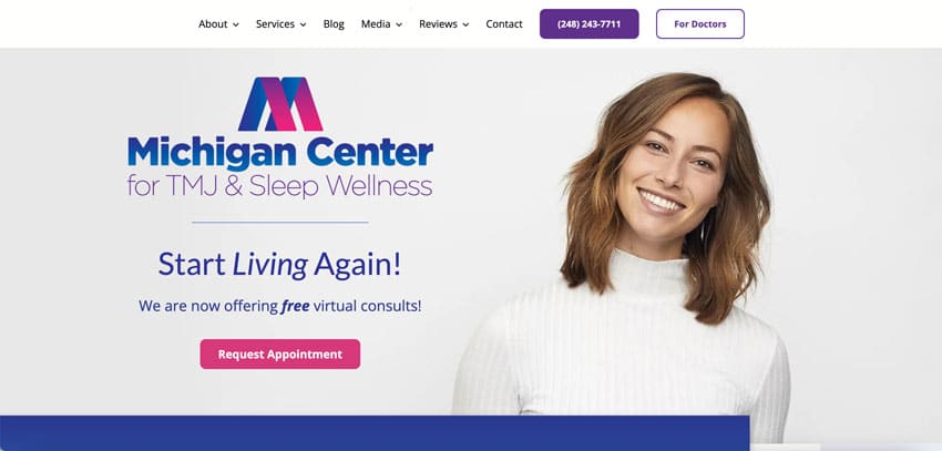
This website is an excellent example of clear copywriting. Immediately after clicking on the website, you see that the Michigan Center for TMJ & Sleep Wellness helps people with TMJ and sleep apnea.
Scrolling down just a little lets you know that if you work with them, you’ll sleep better, feel less pain, and have a transformed life. A little further, you see that they help people in Michigan, and you can get help by requesting an appointment.
The Little Royals

Head on over to this website. What do you see? Immediately, you know they’re a dentist for children and even do dentistry for infants. Front a center, there is a button telling you how to get what they offer.
Your Website
Put yourself in your patient’s shoes and ask yourself these questions.
- Can I tell this is a [insert type] dentist’s website?
- Does my website clearly and quickly say who I help?
- Does my website tell how patients will feel after receiving help?
- Can I easily get help, or do I have to search for contact information?
5. Focused Search Engine Optimization
Dental search engine optimization is how people will find you online. It has to do with your website experience (responsiveness, load times, usability) and the specific words on the page. When you type “dentist in Denver, Colorado” in the search bar, Google searches for the best dental websites that say they’re in Denver, Colorado. Likewise, if you type “TMJ dentist near me,” Google will find websites that say they work with patients who have TMJ and are near you (as long as you have your location turned on).
These specific phrases are called keywords, and your homepage needs to be focused on only a few. If you have too many keywords, Google will be confused as to what you’re all about and not show you high on search engine results pages.
Rice Dentistry: Designed by Pro Impressions Marketing

Simply by skimming the words on this website, you can see that it says they’re in Irvine, CA, and do cosmetic dentistry. Google and other search engines know to serve this website to users looking for cosmetic dentistry services near Irvine, California.
This website provides a great user experience and is optimized on the backend.
Your Website
Sometimes, it can be hard to see proper search engine optimization. But ask these questions.
- Did I (or my marketing company) choose a location to be optimized for?
- Are my signature services on my homepage?
- Does the copy say what type of dentist I am?
- Does my website and all its elements load quickly?
- Is my website easily used on all devices?
- Does my website provide a good experience?
6. Short, Helpful Videos
We love videos! The best dental websites have videos on the homepage because they attract attention. But be wary; too many videos aren’t good because it slows down your website. Stick to only a few short but helpful videos. And by short, we mean two minutes or less. Patients can get the feel of your practice quickly and won’t watch a long video.
Firouzian Dentistry: Designed by Pro Impressions Marketing

Let’s use Firouzian Dentistry as an example of great video usage. There is one video higher on the homepage, lasting less than a minute and thirty seconds. By clicking on the video, you aren’t directed away to YouTube; you stay on the page. Even when watching the video, nothing else on the website is distorted. Some helpful video testimonials live at the bottom of this homepage, and all the videos load quickly with the website. They’re great on mobile, too!
Kingstowne Dental Specialists

Here is another example of video usage on a website. This website has a short video in the banner. It’s eye-catching but not big or long enough to negatively affect the website’s speed. They have a welcome video further down that may be a little too long, but it doesn’t direct you away from the page and shares some helpful information.
Your Website
It’s your turn. Ask yourself these questions about your website.
- Do I have any videos on my homepage?
- Do they communicate information that patients would want to know?
- Does my video take me away from my website?
- Is the video too long?
- Do I have too many videos?
- Is my website loading videos slowly?
Do You Want To Have The Best Dental Website and Attract New Patients?
How did your website do when stacked up to some of these elements? If you find your website lacking, Pro Impressions Marketing builds the best dental websites. Call (970) 672-1212 or schedule a consult online. Our digital marketing consultants can help you determine what’s wrong with your website and how you can improve it.
Or, fill out our free online Marketing Report form to get an idea of how your marketing is performing.


